
This has to be one of my favourite topic as I am very fond of designing and for me aesthetics really do matter. LOGO for a school is an extremely important sign element. When i look around and see the school logos of the new and upcoming schools I find a lo of them who are getting it designed through established ad agencies or professionals they are doing fantastic job whereas the logos in smaller cities are still as horrible and stuck in time as they have been.
Let us try to understand the schools logos and its element
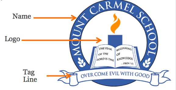
Now here there are three elements are in play
- Name of the School
- The LOGO or the Design
- The Tag line
Though here all three of them come together to form a logo unit. So what are the considerations one could keep in mind while giving the brief or designing a logo for a school;
- It should not be too intricate
- The reason being the more complex it becomes, it is difficult to create the same on school uniform, socks, belts tie, pens etc
- It should not have gradient colours
- The idea (most of the time) should be to avoid gradients in the type face or the design, since it is difficult
- Should be proportionate in dimensions
- Now a days a logo is required to be used across various mediums in which the internet features strongly. Try creating a logo which is proportionate in size and is clear even when made into a 10kb or a 15kb file.
I believe the logos like Books, Graduation caps, pens, pencils, nibs, kids flying with their hands in the air etc are done to death, try new elements.
[Contact_Form_Builder id=”2″]

I am a Marketing-Media professional which has helped me in shaping what I am today. I am Chemical Engineer with an MBA in Marketing.
You can know more about me at www.linkedin.com/in/abhineysingh
You can mail me on abhiney@brightoninternational.in or call me on +91 70002 40006. This number is also on whatsapp.
Get in touch
- Open / Starta School in India and CBSE Affiliation - May 31, 2022
- Private School getting Affiliated as a Sainik School - January 28, 2022
- Teacher Awards - September 20, 2021

Sir please suggest pre school name in Sanskrit
new cbse residantional school in latur in maharashtra
Dear Mr Chauhan,
What is the help you need from me.